Wherever you are in the world, the place is likely to have been mapped in detail by the Soviet Union at least once. During the Second World War, Stalin ordered his military to carry out a secret global mapping programme, a programme continued by his successors throughout the Cold War. From their drawing offices around the USSR, thousands of Soviet cartographers were busy mapping the globe – from the Pyramids to the Pentagon and their tremendous legacy is only just coming to light.
Soviet maps are comprehensively detailed and include a wealth of information beyond that of any published national topographic maps. They can tell you about the height of a bridge above water, its dimensions, load capacity and the main construction material. They can tell you the width of a river, the direction of its flow, its depth and whether it has a viscous bed. They can tell you the type of trees in a forest, their height, girth and spacing. They can also tell you the name of a factory and what it produces. At each scale, Soviet topographic maps conform to a consistent specification that includes a standard symbology, a uniform datum, a common projection and a standardised co-ordinate system.
Soviet maps are as chilling as they are amazing. Chilling because they have the power to unnerve us when we see the city where we live, or the landscape of our childhood presented in unfamiliar colours, symbols, and most of all, in a different language. That these maps were created as part of a secret military programme enhances their intrigue. What did they know? Was my street mapped? How did they do it? And what did they get wrong?
Our research investigates the results of this unparalleled cartographic feat. The true extent of the enterprise is yet to emerge, but this is clearly the most comprehensive global topographic mapping project ever carried out: the number of different maps produced is impossible to quantify, but one estimate puts the figure at more than 1m.
"Soviet maps are as chilling as they are amazing"
The main series were small- and medium-scale topographic maps and large-scale city plans, all having the most comprehensive system of symbology and annotation ever devised. There were also many special maps for specific purposes.
Global mapping
All mapping relies on the establishment of, and adherence to, a standardised, uniform policy covering what is to be mapped, to what level of accuracy and detail, and how, through hundreds of cartographic symbols. The Soviet symbology and specifications, which evolved substantially between the 1940s and 1990s, were designed as a system applicable worldwide and adaptable for all scales and series of maps. They portray terrain and communications and identify cultural features in a standardised way, to enable map users to familiarise themselves quickly with the landscape depicted.
Many hundreds of specific symbols were devised, including those for differentiating the purpose of individual buildings, the religion of places of worship, the type and density of vegetation and crops, and the characteristics of the terrain and coast. Colours and hachuring – short lines or curves – identify built-up areas where non-fireproof buildings predominate, or city blocks that mostly comprise high-rise multi-storey structures, for example.
Of particular interest to cartographers, and potentially map users, is the symbology indicating 'the going', that is the difficulty of traversing the terrain. Railways, roads, mountain passes, ferries and bridges are shown in detail, as are forests and rivers that might impede progress. About 20 classes of lettering with varying sizes and styles indicates the relative size and status of towns and cities. Similarly, navigable rivers are labelled in upper-case and non-navigable ones in lower-case letters.
World grid
The sheet lines for the topographic maps are based on a world grid that was originally devised for the International Map of the World (IMW), the specifications of which were drawn up in 1909. This divides up the globe into belts of latitude, each four degrees wide and lettered A–V running north from the equator, and zones of longitude, each six degrees wide and numbered 1–60. Band M covers latitudes 48° to 52° and longitude 0°; the Greenwich Meridian is the boundary between zones 30 and 31. London, therefore, spans grid squares M-30 and M-31.
For every grid square there is a topographic map at scale 1:1,000,000. For each of these there are four sheets at double the scale – 1:500,000 – 36 at 1:200,000, 144 at 1:100,000 and 576 at 1:50,000. These are all secret military maps, complete with precise geodetic co-ordinates. Sheets at all scales conform strictly to the IMW grid, giving continuous coverage with no overlap. The sheets are not rectangular and they narrow towards the poles as the lines of longitude converge.
In the USSR, there was also systematic topographic mapping at the larger scales of 1:25,000 and 1:10,000, as well as a series intended for use by the civil authorities; the maps in this series deliberately omit geographical co-ordinates and geodetic information, and are based on completely different sheet lines, ensuring that they would be useless for targeting or other military purposes should they have fallen into the wrong hands.
The earliest Soviet topographic maps of the British Isles we have found so far are some 1:1,000,000 sheets from 1938, indicating that the global mapping project had started before the Second World War. Later editions of the smaller-scale maps date from the 1950s; new editions from the 1970s and 1980s. Larger-scale maps were produced in the 1960s, 1970s and 1980s.
"Clearly, the Soviet mapping project was considered by the Kremlin to have been worth the huge investment of resources"
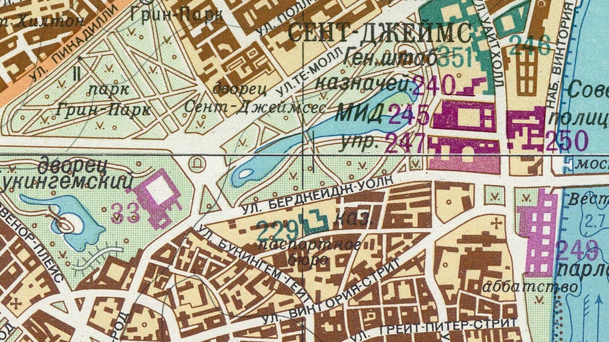
The city plan series are at larger scales, almost all at 1:25,000 or 1:10,000 with a few early examples at 1:5,000. These are non-continuous rectangular sheets, centred on specific urban areas. There is a set of non-overlapping sheets for larger conurbations, usually two or four, meeting near the city centre. City plans also use the Gauss–Krűger projection, with each zone adopting a local meridian, spaced at six-degree intervals around the globe to minimise distortion. They have a grid of kilometre squares, numbered as the distance north from the equator and the distance east or west from the local meridian.
Notable features
There are two particularly notable features of the city plans: the list of important objects, and the справка (spravka). The former are coded on the map by colour – green for military, purple for governmental, black for industrial – and are numbered on the map and listed in alphabetical order in the margin. Where these objects run into several hundred, they are sometimes listed in a separate handbook. London is one such example, its handbook identifying nearly 400 important objects, many by name and purpose, while others are more generic, such as a factory producing unknown goods.
The spravka, or reference, is an essay of typically 2,000–3,000 words, describing the location, topography, transport links, economy, industry, buildings, ethnicity of the population, civic amenities, medical and sanitation facilities, and other utilities. The plans also include a street index.
Such plans are known to have been produced for more than 2,000 cities around the world – many others may have been drawn, but have not yet been discovered. For the British Isles, about 100 are known, the earliest examples being the 1950 editions of Milford Haven and Pembroke, both deep-water naval ports, the latest a plan of Falmouth, also a naval port, dating from 1997, after the collapse of the USSR.
The bulk of the maps date from the 1970s and 1980s and include not only the major conurbations and industrial centres, but also smaller towns such as Dewsbury, Dunfermline, Kilmarnock and Londonderry. For several towns, more than one edition was produced; for example, Bournemouth (1974 and 1990), Cambridge (1977 and 1989), Cardiff (1972 and 1982), Halifax (1975 and 1989) and Luton (1973 and 1986).
"Such plans are known to have been produced for more than 2,000 cities around the world"
The plans depict some details that the cartographers considered important enough to identify but that did not appear on Britain's own Ordnance Survey maps at the time. Examples include whether or not a railway was electric; whether a station serves a tube line or a national rail line; whether or not a river is navigable and its banks suitable for mooring; the location of bus stations; the width, clearance and carrying capacity of roads and bridges; and the European through-route number of the major highways, with the M1 for instance also labelled as E33 and the M11 as E112.
Clearly, the Soviet mapping project – active for more than half a century and producing untold thousands of maps with a considerable amount of detail and a very high level of accuracy, all printed on good-quality paper – was considered by the Kremlin to have been worth the huge investment of human and financial resources. The question is why. The maps do not primarily identify targets for bombing – as, for example, the 1940s German invasion mapping of Britain did – and if the intention was nuclear warfare, there would seem little point in providing the exact location of a city’s bus station.
The more plausible explanation is that the maps were a repository of geospatial intelligence that would be required in the event of Soviet world domination.
Related competencies include: Geodesy, Remote sensing and photogrammetry, Surveying and mapping