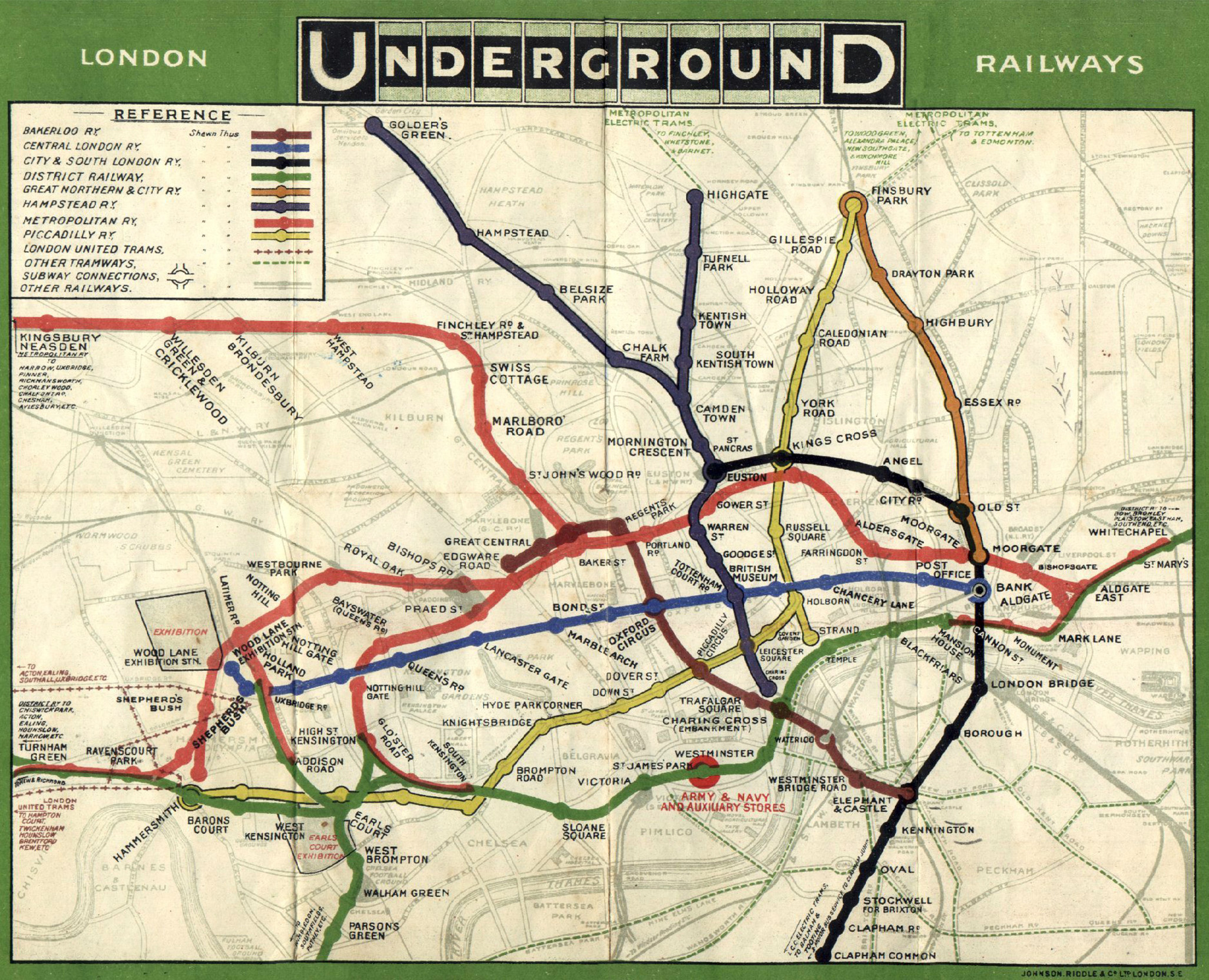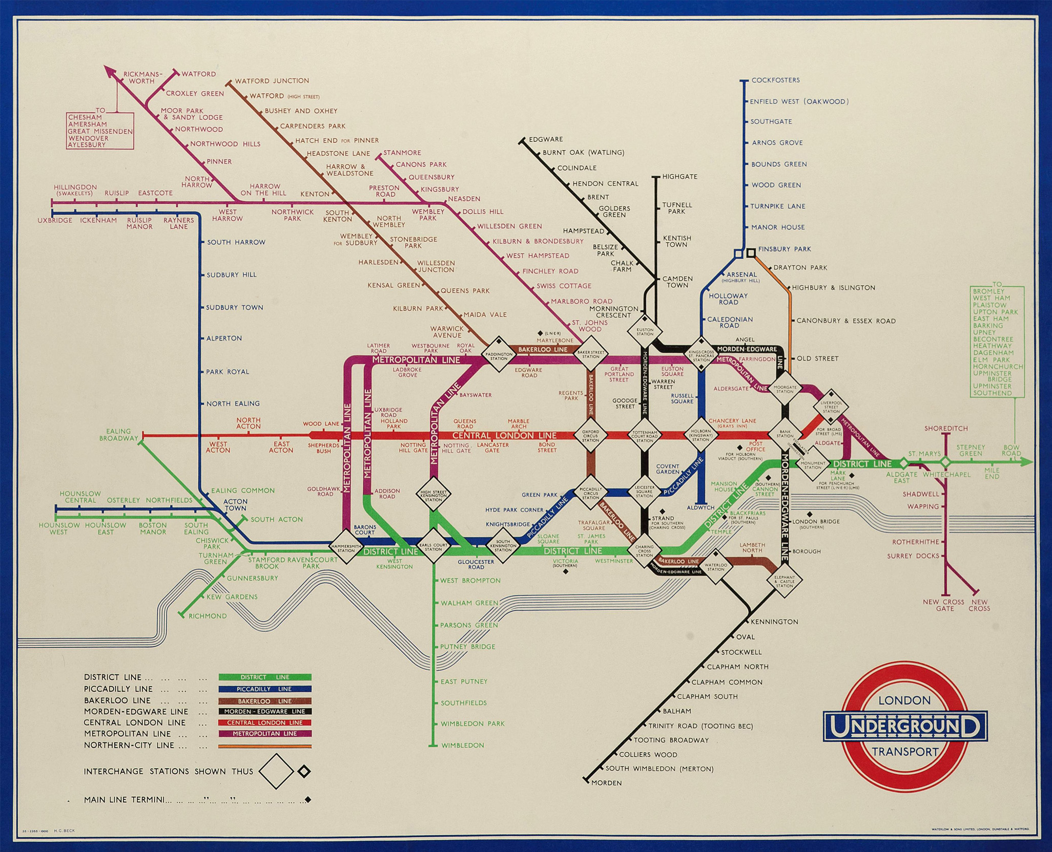
In 1931, Harry Beck, a draughtsman working for the London Underground, submitted his design for a map of the city’s rail transit network.
Although its bold colours and scrapping of scale meant that it was initially rejected by the directors of the Tube, the map – as any visitor to London can attest – became iconic, the stuff of a million mugs, tea towels and mouse mats.
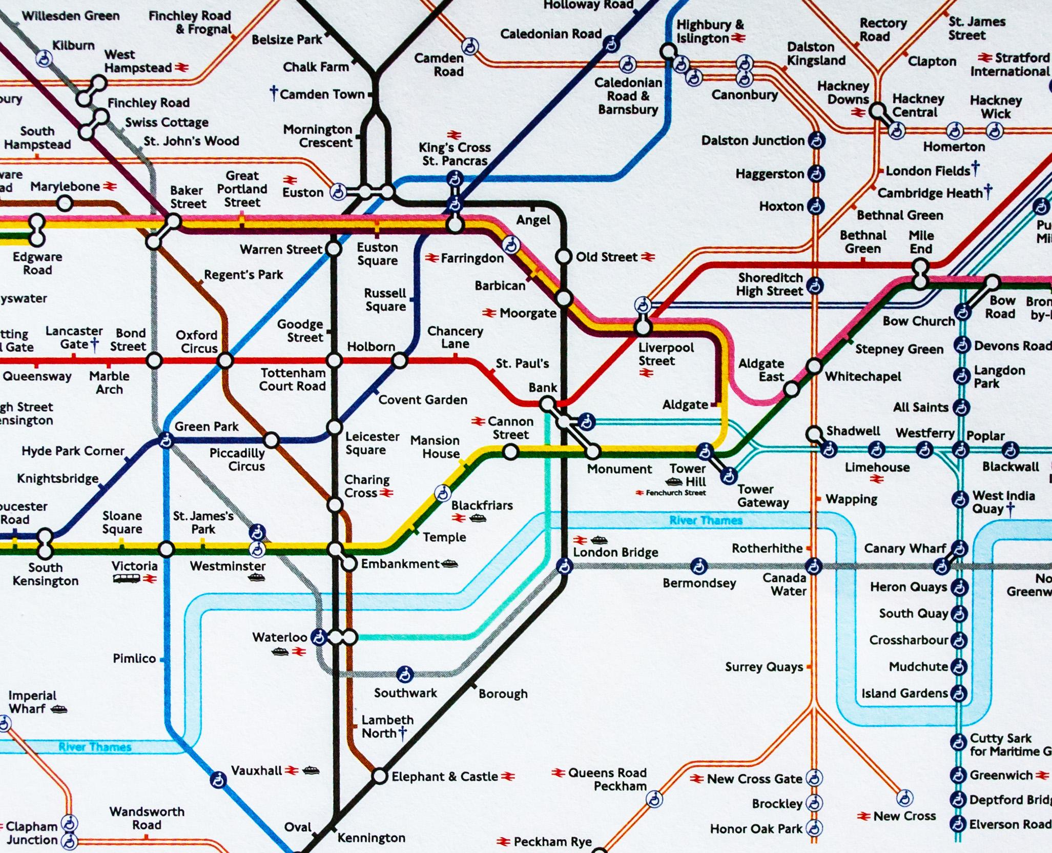
Almost 100 years later, and with the addition of more than 250 new stations and several new lines, the map is still recognisable as Beck’s original work.
But, while Beck set out to create a simple way of navigating the increasingly complicated spaghetti of a Tube network with little consideration of his legacy, the success of his map has hung heavy over mapmakers ever since. No one in London has dared to tinker with its schematic principles of straight lines and neat angles. And, as the maps of many other cities’ subways show, its influence has spread: a huge proportion of subway systems across the world have tried to adapt it to their own networks regardless of its suitability.
Even in London, as the network has sprouted more lines and brought much of London’s overground web into its fold, the bright spectrum of Beck’s map has given way to a Pantone colour chart of barely perceptible shade differences. Who, at a glance, can tell the difference the green Suffragette Line and slightly darker green District Line, or the maroon Metropolitan Line and the burgundy Weaver Line? Is the Beck map still fit for purpose?
“The problem with the map is that it dates a long way back,” says Dr Maxwell Roberts of the University of Essex’s Department of Psychology. “If you go back to 2000, it’s been updated and [new elements] patched in … But to call it a Frankenstein map is too kind because at least when Frankenstein was assembling his creation, he was looking for good quality parts. This is an arbitrary design collection. It’s like going to a scrapyard and trying to assemble a car.”
Ouch. Roberts’s comments might not have Beck turning in his grave – he was, by all accounts, a very modest man – but it is something of a surprise to hear this sort of gloves-off description of such a beloved design. Nevertheless, Roberts is not merely carping from the sidelines. He has redrawn the Tube map – and several other cities’ underground system maps – into a far more logical and reader-friendly scheme.
It is as radical reimagining of Beck’s map as Beck’s map was of the original looping, tangled underground map. He has created circular sections of London and, while it does not pretend to be geographically accurate, the positioning of the stations aligns much closer to their relationship with each other than on the current map. (There are apocryphal tales of cabbies taking hapless tourists from Euston Square station to Euston station, a journey of about 150 metres in reality, but with nothing to indicate that on the map.)
There is a harmony to its composition and, most importantly, it is easy to read – making sense of the recently upgraded London Overground lines, Wimbledon tram link and other, more suburban additions. It takes him, he says, about two weeks to design a map and he has done about 200. One of the hardest tasks is fitting in some of the station names. King’s Cross/St Pancras International is a particular challenge.
But why is a psychologist involving himself with what many regard as a purely technical task?
“Psychology tells you what you should be aiming for in terms of effective design and my branch makes maps as clear as possible when it comes to quality and amount of information,” says Roberts. “The other thing that psychology gives is it’s a way of evaluating something. Designers have massive faith in their creations and they don’t always get things right. Psychologists have the methods of measuring and evaluating [work]. If Transport for London does evaluation, it doesn’t do it very well. They’re entrenched in marketing methodology rather than more scientific methodology.”
Roberts has been fascinated by the Tube map from boyhood. He grew up in the south London suburb of Dulwich, a neighbourhood without a tube station, and collected free, pocket Tube maps on days out. “When I was a teenager [in the 1980s], I noticed they didn’t look as nice as the older ones.”
He embarked on a career in academia with a particular interest in intelligence, reasoning and problem solving. Maps are an excellent means of testing his research and, in particular, ‘cognitive load’ – the amount of effort your brain needs to process information – and ‘cognitive capacity’, the amount of information any individual’s brain is able to process. Too much information is very much a bad thing and so too is a lack of precision.
“Ambiguous information gives us problems,” says Roberts. “[Designers] aren’t thinking the problem through carefully enough. They’re not thinking about what is needed.”
One of Roberts’s favourite ways of illustrating how poorly information can be provided is to take unsuspecting individuals to the V&A Museum – one of London’s most prestigious – and tell them to find the 20th Century Gallery without asking for help. Not many, it would seem, succeed.
“Sometimes you think [things] are too complicated and the best way to make the map better would be to close down half the lines. But the more complicated, the more you have to invest, in my opinion,” he says. “Every city is different, and to be successful [in conveying information], you have to identify the design rules that allow you to satisfy the best design.”
But lest we think that bad mapping is a purely British disease, Roberts has strong opinions on the subway maps of many cities outside the UK. While he has a soft spot for Stockholm’s metro and St Petersburg’s “hasn’t been ruined”, New York’s old scheme was “a chaotic monster”; Madrid’s is “appalling”; Paris “follows London’s design rules but doesn’t make them easy to understand; Amsterdam “I’m not a big fan”; Tokyo is “quite a challenge”.
Perhaps, however, maps are under threat less from bad design and poorly thought-out information than they are from technology. The march of all-conquering journey planning apps and software has relegated their importance and made us all a bit lazy – something that has not escaped Roberts who applies the rule of thirds.
“A third of people like maps and timetables. A third of people don’t particularly like them but will use them. A third of people don’t like them and won’t use them. The current status of mapping is so bad that it’s forcing people towards the apps, even if they don’t want to use them. There are people who prefer to think the journey out themselves but they’re almost being prevented. [Using maps and diagrams] is something we should encourage. You learn self-sufficiency.
After all, he adds, “understanding maps is a great skill and what is going to happen when your phone battery runs out?”
Explore Maxwell Robert's circular redesign of the London Underground map below
Making maps that work
Simon Navin MRICS is head of geospatial services at Ordnance Survey (OS) and Paul Naylor is GeoDataViz team lead at OS and president of the British Cartographic Society. They explain why Harry Beck’s design has endured for so long and why public trust in mapping is so important.
Harry Beck didn’t just draw a map – he rewired how we think about getting from A to B. Instead of obsessing over geographic accuracy, he leaned into clarity and usability, borrowing tricks from his day job as a technical draughtsman. Think circuit diagrams, but for commuters.
By straightening lines, spacing stations evenly, and sticking to tidy 45° and 90° angles, Beck created a schematic that’s more about sense than scale. Of course, it bends reality a bit – it has to – but in a way that helps. You don’t need to know how far things are, just how to get there without ending up in Zone 6 by accident.
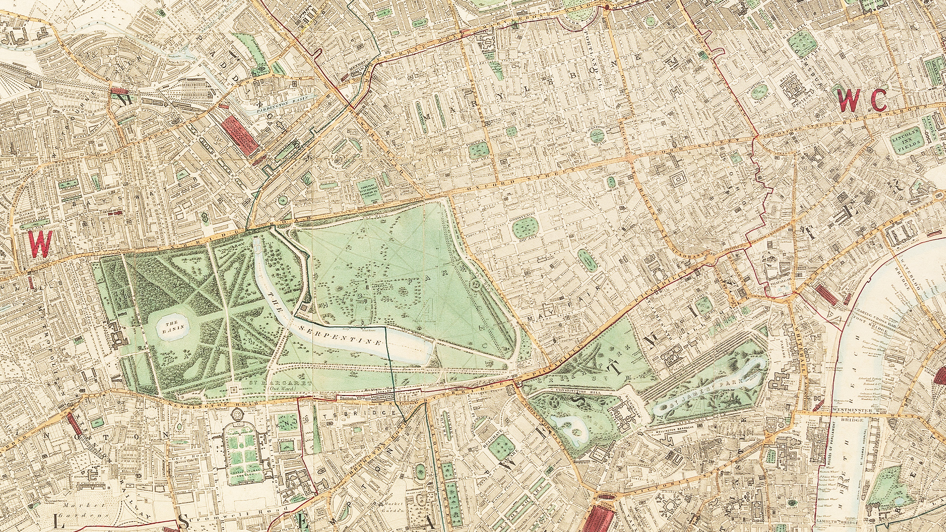
But good cartographic design isn’t just about making things look nice – it’s about making them work. That starts with understanding what the user needs. If the goal is wayfinding, then clarity and simplicity win the day. But if someone’s planning a hike or analysing spatial data, then geographic accuracy becomes the star of the show.
The real magic in Beck’s design is the familiarity. Millions of people around the world have used this design, and that consistency builds confidence. It’s like an old friend who always knows the way – reliable, intuitive, and never asks you to guess which direction north is.
Challenges and opportunities in mapping
Our 1:25k Explorer and 1:50k Landranger maps are beloved by customers. Even the smallest tweak can cause a stir. Case in point: back in 2003, we floated the idea of removing church symbols if the buildings were no longer used for worship. Let’s just say the response to that was... spirited. Turns out, many of these churches are still vital landmarks, thanks to their towers and spires – making them important navigational aids or revered buildings.
OS is Britain’s national mapping agency and we’ve moved on a long way from just our original paper map products. We already use artificial intelligence to understand, interpret and derive insights from geographical data and continue to identify new challenges and opportunities for better mapping and location data insights.
Turning complex geospatial data into something that feels intuitive and user-friendly is easier said than done. Accessibility isn’t just about screen readers and font sizes – it’s about making sure people get what they’re looking at, no matter their background or expertise.
Today’s users also expect up-to-the-minute information. Whether it’s traffic, weather, or train delays, embedding real-time data into our solutions is key to staying relevant and keeping users happy.
