A picture may speak 1,000 words, but without data it is not telling the whole story. Throughout the year on Modus, we have analysed the data behind topics such as Australia’s wildfires, car use in cities or how the built environment can tackle air pollution.
Here, we pick out some of the graphs, charts and videos that told some of the most important stories RICS members needed to hear this year.
Out of the ashes – where did the Australian wildfires happen?
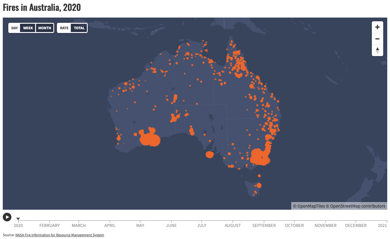

The wildfires – or bush fires – that swept across Australia in 2019 and 2020 caused such devastation that the period has been dubbed Black Summer. Although no stranger to bush fires, atypical heat paired with low rainfall meant that it was almost impossible to contain this outbreak. It threatened some of the country's biggest cities, including Sydney, Melbourne and the capital, Canberra.
This video uses NASA data to show the distribution of wildfires that burned continuously in Australia throughout 2020. The problem of wildfires is not isolated to Australia though, and Out of the Ashes highlighted how they are happening with increasing regularity all over the world.
And while the name wildfire suggests they are happening out in the wild, away from urban populations, this is not the case. In California, the blazes regularly breach city limits on the edges of Los Angeles, San Francisco, Fresno, Stockton, Sacramento and San Diego.
As the smoke spreads, what can surveyors do to keep people safe?
Incredible India – how densely populated is it?
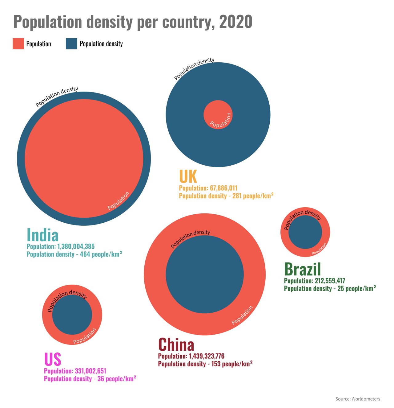
Of the five nations represented above, India is the most densely populated by far. While it does have a relatively large land mass of 3,287,263km2, its population of nearly 1.4bn means it is as densely populated as countries that are geographically much smaller.
This level of population density presents challenges for urban planners. Mumbai, for example, has 51 new residents every hour who all need to be housed, employed, transported or fed. Their waste needs to be taken away and they all need access to health services.
“The pace of growth is putting pressure on a city with constrained land supply and soaring congestion,” says The London School of Economics research programme Urban Age.
Reshaping our cities – transport use by gender
Gender has been shown to affect people’s transportation choices. This chart asked residents of Berlin, Copenhagen, Delhi, Espoo, Helsinki, Oslo, Stockholm and Vantaa which methods of transport they used. A higher proportion of men chose car and bike, while a higher number of women chose metro, bus or walking.
Many cities around the world are attempting to wean themselves off car dependence and improve air quality for their residents. Paris, for example, has plans to pedestrianise the Champs-Élysées, renowned as a traffic hotspot, and turn it into an ‘extraordinary garden’. As cities’ transportation infrastructure evolves, the changes will impact different people in different ways. Tracking their use by demographic allows decision-makers to consider the impact their decisions will make on various populations.
How are cities changing and what impact is this going to have on the roles of surveyors?
Code red – how much warmer are we making the planet?
The planet has already warmed by nearly 1°C because of man-made emissions such as burning fossil fuels. The temperature anomaly chart above uses data from the UK’s Met Office to show the difference in temperature between a particular year and the average temperature between 1961-1990.
Although we are all contributing to global warming, the effects are not spread evenly throughout the world. Certain countries are more prone to natural disasters exacerbated by climate change, such as flooding, hurricanes or droughts.
The innovation of RICS members is crucial to keep people safe. When Modus spoke to the World Energy Council’s Dr Angela Wilkinson before COP26, she suggested that many countries are giving serious thought to climate adaptation as well as climate change mitigation strategies.
Tackling air pollution – are we making a dent in CO2 emissions?
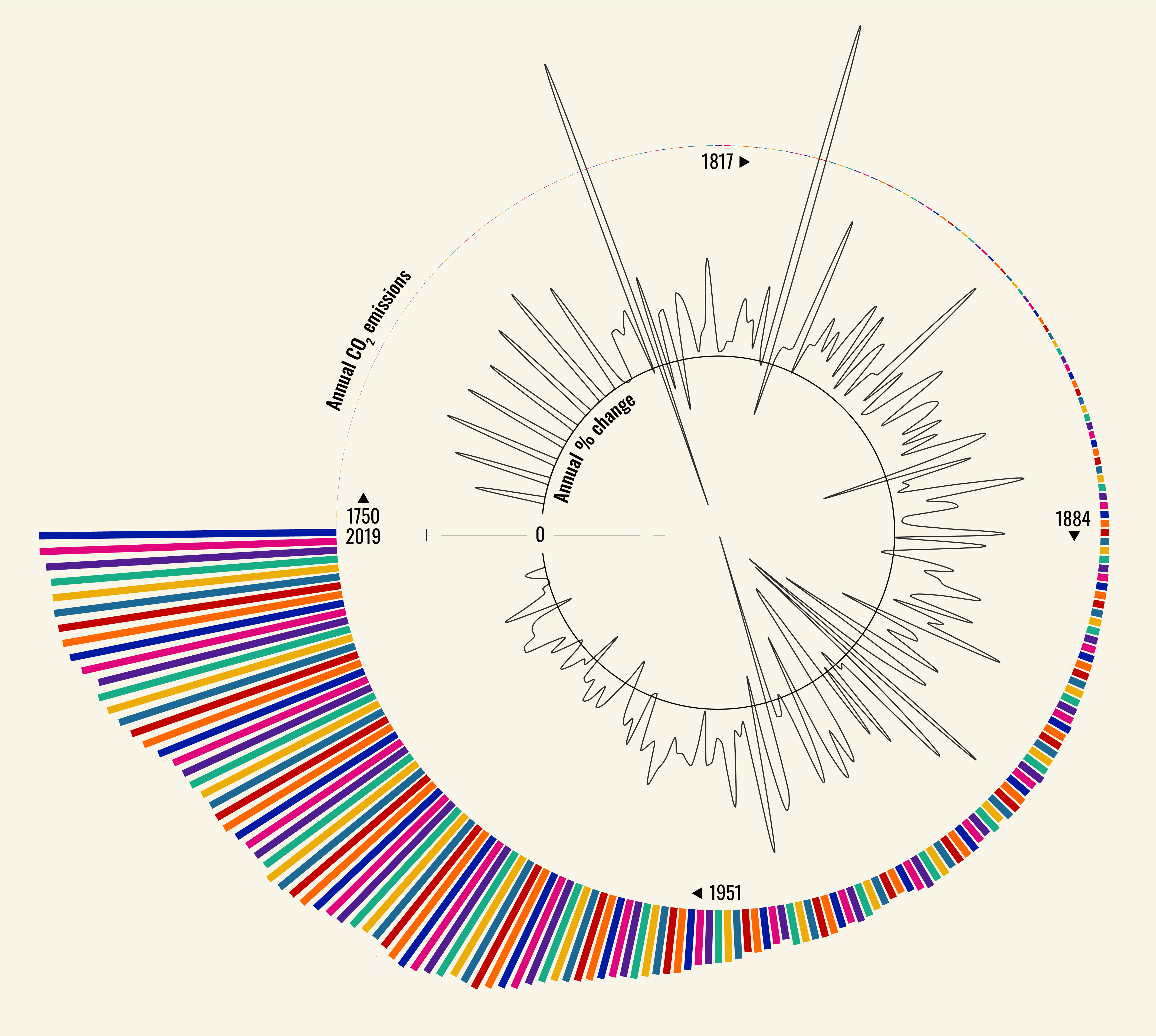
This graph shows that global efforts to tackle air pollution are having a slow but steady effect. Although the total amount of CO2 emissions is increasing, emissions growth has slowed during the last few years.
The outside circle in the graph runs from 1750 to 2019 and shows the annual global CO2 emissions in tonnes, caused by the burning of fossil fuels for energy and cement production.
The inner circle shows the year-on-year percentage change in CO2 emissions from fossil fuels and cement production. The black circle is 0; lines which go above the black circle depict an increase in CO2 emissions, and the lines that go below the black circle show a decrease in emissions.
Overcoming our dependence on fossil fuels – how quickly are we transitioning to clean energy?
A major part of the push towards becoming a net zero world is the need to get more of our energy from clean, renewable sources. Built environment professionals around the world are making meaningful steps towards greater use of sustainable energy but the pace of change differs greatly from country to country. What can RICS members learn from leaders in the field of renewable energy, such as Australia or Germany who generate around 10% of their total power consumption though solar?
This video explores the data of energy production and consumption to ask whether we are moving to renewable sources fast enough.
Make sure you don’t miss anything on Modus by signing up for our newsletter.

